Michael Peterson
Software Architect
SpinSys
Introduction
In an effort to increase transparency, the U.S. Department of Veterans Affairs publicly releases their Strategic Analytics for Improvement and Learning (SAIL) data quarterly. The SAIL data contains twenty-five measures across different areas that gauge how well a VA medical center is functioning. The measures range from patient satisfaction survey results to provider efficiency and capacity measures. SpinSys provides similar support and experience for the visualization and analytics of big data for the Defense Health Agency. As part of our research and development efforts we analyzed the SAIL data, then leveraged our experience, knowledge, tools and products to quickly develop a proof of concept serverless, progressive web app (PWA) that allows you to explore and visualize the VA SAIL data.
Before getting into the details of the app we will provide a quick overview of serverless computing and progressive web apps.
Serverless Computing
Serverless computing allows you to run applications without having to manage the underlying infrastructure. Instead of provisioning virtual machines and maintaining them, you can deploy code into a cloud provider’s environment and allow them to manage the necessary resources. Of course your code still runs on servers, but you do not need to worry about securing or maintaining them. Serverless computing services, such as AWS Lambda, have several advantages over the renting of individual machine instances as you would in AWS EC2. By eliminating maintenance overhead from not needing to patch the operating system and other server components, you can greatly reduce your operations budget. You also only pay for actual use instead of potentially paying for hours of idle time. Instant scalability and speed of deployment are huge advantages of serverless platforms as well.
Progressive Web Apps
Progressive web apps are web applications (HTML, CSS, JavaScript) that implements various features, techniques and patterns to provide an optimal user experience. They are responsive to the device/browser, cross-platform, work while offline or on an unreliable network and can be installed as first-class apps on mobile operating systems without the nuances of going through an app store. If tighter integration with mobile platform features is necessary, our toolset also easily allows developers to deploy the app through app stores.
Visualizing VAÂ Medical Center Performance
We first analyzed all the SAIL data published by the VA. It is provided in a common Excel format. There is a spreadsheet per medical center and quarter. At the time of writing this post, there are six spreadsheets available per center. Each contains the measure name, unit of measure, preferred (is lower better?), measure value for the medical center, their benchmark and 10th/50th/90th percentiles for the measure. We were interested in how the medical centers were performing over time. We could download all six spreadsheets, merge them and then visualize the data, but that is a painstaking process to do for over a hundred centers.
We decided to use Amazon Web Services (AWS) Lambda to build a .NET Core 2.0 function that can retrieve all the available spreadsheets for a given medical center, extract the relevant data elements and provide them in a JSON format to our progressive web app. The C# code retrieves the spreadsheets asynchronously in parallel. Once the spreadsheets have been retrieved and parsed, the quarterly data is merged together and returned in a JSON array to the app. Once we had the code unit tested, it then took just a few clicks using the AWS Toolkit for Visual Studio to publish the Lambda function to AWS.
After publishing the Lambda function, we had to expose it to our app via our cloud based API gateway. After a little bit of configuration to map the incoming center from URL parameter to function input, we had a fully functional and scalable RESTful endpoint ready for prime-time.
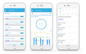
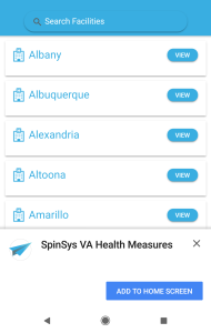
Now that our service layer was complete, we worked to produce a responsive, progressive web app to visualize the SAIL data we were returning in JSON format. We created a page with a searchable list of medical centers. Upon selecting one, you can view all the measures and a sparkline that provides a quick snapshot of how they have performed over time. Each measure is colored based upon the 10th/50th/90th percentiles and the current quarter’s value. If they are below the 10th percentile then we display the measure in red. Between 10th and 50th we display them as yellow. If they are between the 50th and 90th they are shown as green. We decided to use blue if they are at or above the 90th percentile.
If you select an individual measure, you are taken to a detail screen that shows a gauge at the top, a chart displaying the values over the time and the detail numbers below. The chart is interactive and lets you change the time frame for the data displayed. If you move the time frame to the right, all the detail numbers will refresh to the latest data elements displayed.
Once the app was built, we uploaded it to an S3 bucket in AWS. Click here to launch our PWA
By utilizing our agile mobile methodologies we were able to go from idea to proof-of-concept within a week. To learn more about our mobile app development approach please check out this post:  Agile Mobile Apps Development


